
Mazda is also going flat: this is their new logo
Less gloss, more pixels
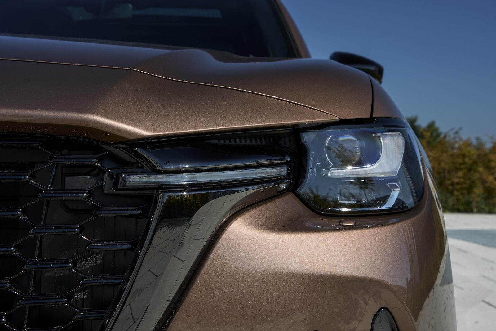
3D design is out, 2D is in. At least – in automotive land. Not because it’s hip, but because it’s practical. Nowadays, a brand logo must be just as visible on a small smartphone screen as on a large billboard along the highway. And let that be just a little more difficult with shiny 3D logos with shadows. That’s why many car brands have already flattened their logos. And now so has Mazda.
New Mazda logo
At the Japan Mobility Show 2025, the brand presented its revamped brand logo. The familiar wing-shaped M – the face of Mazda since 1997 – remains, but now looks tighter, sharper and, above all, flatter. Mazda emphasizes that it is not a radical break with the past, but an evolutionary step. According to Mazda, the “soaring wings” still symbolize movement and ambition, but the shine and depth are gone.
From grille to website
The wordmark also received a refresh: the letters are thinner, more modern and easier to read. The first models with the new logo are the new CX-5 and the electric EZ-60, which previously appeared in China with the revamped badge. For now, Mazda is using both logos side by side, depending on the model and market. The rollout will be incremental: first digitally, then physically.
Ahura Mazda
By the way, did you know that the name Mazda is not a Japanese word, but refers to Ahura Mazda, the Persian god of light, wisdom and harmony. The Japanese brand once saw that name as a perfect translation of its own philosophy: balancing technology and people. In the video below, we tell you how famous car brands got their names and logos: