What the heck: Citroën is changing its logo!
Doubles chevrons
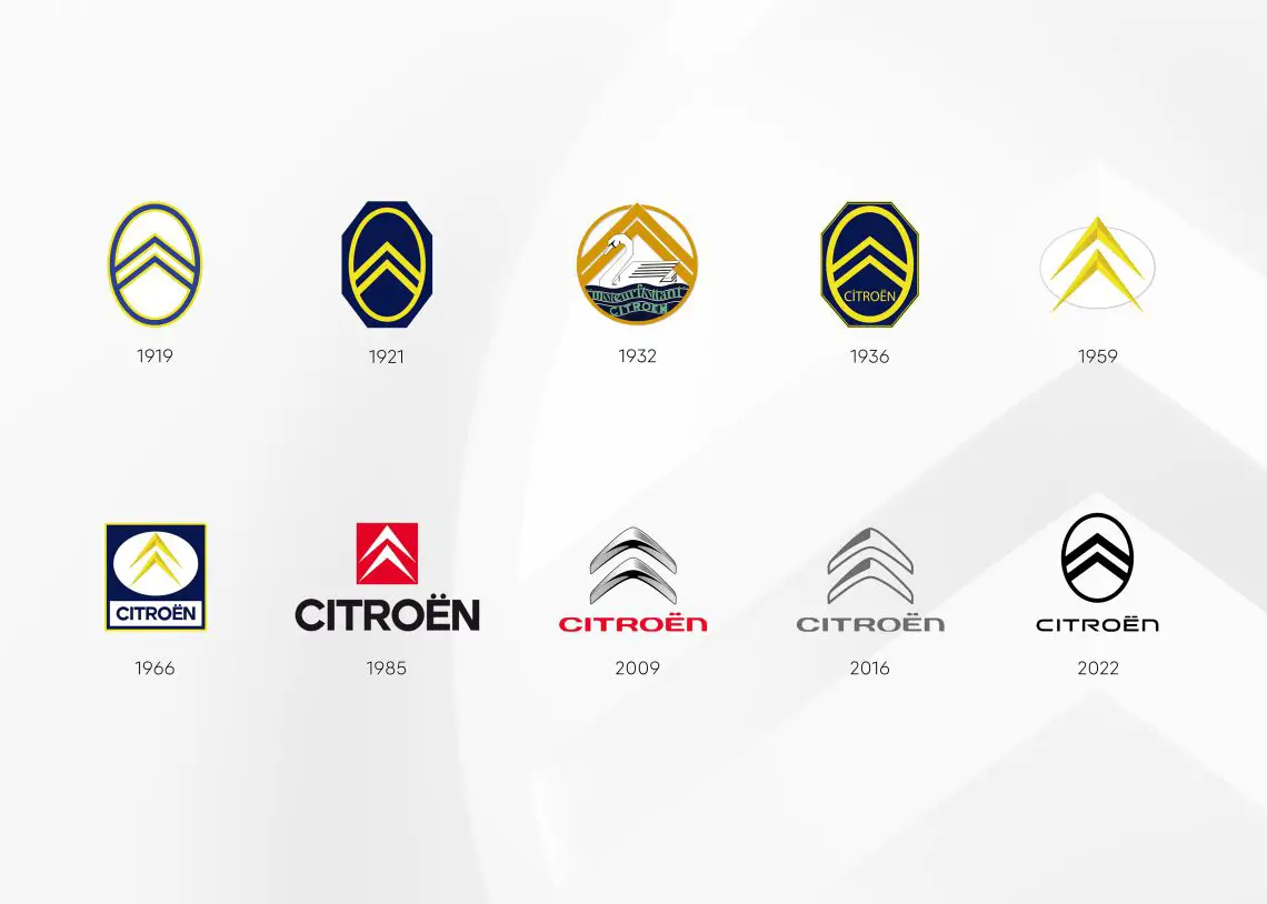
The new Citroën logo is a new interpretation of the original logo used by founder André Citroën. That logo was inspired by the successful products of his first venture, a metalworking company that produced bevel gear systems. The famous “doubles chevrons” in the logo and the reference to bevel gears have been at the heart of Citroen’s identity ever since.
Mid-2023 on production models
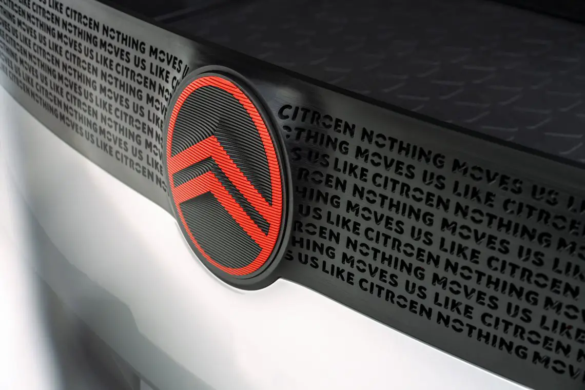
But now Citroën is introducing an entirely new logo. The new logo will debut in late September on a major concept model of a family car. Starting in mid-2023, the new logo will be seen incrementally on production models. The prominent and powerful oval shape refers to the new direction of Citroën’s design language, in which the distinctive logo becomes an instantly recognizable style element on all new Citroën models.

Tenth restyling
The evolution of the logo is already the tenth restyling of it since the company was founded in 1919. From now on, the chevrons are wider and more emphatically reflected in the soft-lined, vertical oval frame of the logo.

New corporate identity
The rollout of Citroën’s new logo coincides with the introduction of a new corporate identity. Combined with the motto “Nothing moves us like Citroën,” the new logo and brand identity allude to the upcoming turnaround in the brand’s approach to the future of affordable mobility solutions and its commitment to providing relaxed and worry-free customer service.

